Read just about any review, watch any tutorial, or head to Adobe's website and you'll hear the same thing: Adobe Illustrator CS6 sports a new "dark" user interface. It helps "get the user interface out of the way" and it "lets you focus on your design". That's all true, but that's like marveling at the shiny gift wrap on a new present. It's not the outer wrapping that deserves the focus here -- it's what's inside the box that really counts.
More than just a fresh coat of paint.
In previous versions of Illustrator, the programmers at Adobe used a framework to build panels and dialog boxes. This framework was 32bit and also had certain limitations. Since Illustrator CS6 was going to be 64bit, Adobe had to move to a 64bit framework, meaning that every single dialog box, and every single panel -- in the entire application -- had to be rewritten.
When you rebuild something from scratch (instead of just trying to patch it up), you benefit from the following:
- Any old issues automatically disappear (although that doesn't mean you won't necessarily introduce new ones). Still, any issue that happened in the past (i.e. bugs) are gone.
- You automatically benefit from newer technology. Meaning if the new interface framework has better support for things like keyboard navigation, then all panels and dialog boxes get that support -- automatically.
- You have an opportunity to address or rethink design.
It's that last bullet point that really stands out. Once Adobe was going to have rebuilt all these dialog boxes and panels anyway, they figured that at the same time, it might be a good idea to also revisit the design and function of them.
Redesigned and enhanced.
For example, you'll notice that in Illustrator CS6, every single dialog box now consistently features Cancel and OK buttons in the lower right corner. Previous versions were inconsistent with some panels having these buttons at the top right or elsewhere.
The Color panel has been updated to support a resizable and much larger color sample area, easier to find buttons for Black, White, and None attributes, and specifically with Hexadecimal colors, a single text field so that you can easily copy and paste values.
 |
| The Color Panel from Illustrator CS5 (left) and the new one from Illustrator CS6 (right). I set my UI brightness in CS6 to match that of CS5 for easier comparison. |
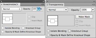
The Transparency panel has been updated to raise awareness of an incredibly powerful feature that has been "hidden" since it was introduced back in Illustrator 9: Opacity Masks. Now, a Create Mask button is clearly found directly within the panel instead of having to dig in the panel's fly out menu.
 |
| The Transparency panel from Illustrator CS5 (left) and the new one from Illustrator CS6 (right). |
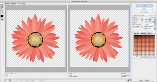
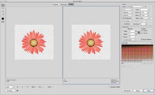
The Save for Web dialog box has been totally revamped, allowing you to see and modify the image size and color settings at the same time, and the dialog is more streamlined, allowing you to export web graphics more efficiently.
 |
| The Save for Web dialog box in Illustrator CS5 |
 |
| The Save for Web dialog box in Illustrator CS6 |
These are but a few examples of what the new user interface in Illustrator CS6 means. It's not about how light or dark the interface is. It's brand new, with new capabilities (rename layers, artboards, brushes, symbols, etc -- all directly inline in the panel), and a smoother and silkier feel. It's kinda like how I always imagined the user interface for Illustrator should have always been.

15 comments:
The cancel / ok below the windows make so much sense when you see the wasted space on some of Photoshop's menus... (especially with localized interfaces) I will make a suggestion on the Ps feedback site.
what about the dorky way of coloring seleceted objects via color picker?
live color update, or still drag, release = see result?
Can Scripts be assigned with hotkeys like PS does?
Zoom to selected comes to mind..
Any improvements with the Artboards? (like default move/copy artwork w artboard Deselected?)
As a long time Illustrator user, I'm really disappointed with the insane amount of wasted space in the newly redesigned panels. It's funny you mentioned the Color panel as an example of how the panels have been improved, because that particular one is perhaps the worst of all. At the smallest usable size (I need the sliders), it's now 67 pixels taller than the one in CS5 (not counting the extra borders and gutter, which take up another few extra pixels), with absolutely nothing gained from all that wasted space. There's no way to turn off the color band at the bottom, which I never even use, but if you want to see the sliders, you're stuck with the color band. (This was true in CS5 and earlier, but at least the sliders weren't spaced so comically far apart for no good reason.)
The Align panel is equally awful; it has the exact same set of controls as before, but now it's 39 pixels taller. The same goes for pretty much all the other panels too.
Why on earth was it necessary to space out all the controls? I *never* once had any problem clicking on any of the controls in any of the panels, but because of their new space-wasting designs, I can no longer fit as many panels in each column, forcing me to revise the UI layout I've used for years, and again, there is no benefit whatsoever gained from all this wasted space.
There are a few improvements in the panels, mostly in the form of extra functionality that was previously buried in the panel menus, but overall the "new" UI in CS6 is a swing-and-a-miss.
If only Illustrator was supported by Configurator. I'd happily fix all the ruined panels myself if there was any way to do so. Until that happens, all I can do is plead with Adobe to stop making Illustrator's UI worse with every major release.
I have only just downloaded CS6 as a subscription (Previously using 5.1). Thanks for the explanation on the reason behind the changes to the UI. Apart from some upgrades needed in some of the PlugIn tools (CaddTools) and the fact that the trace function seems to be "less" sensitive, I should be able to get used to it quite quickly.
Thanks
BillR www.whralr.com
my eyes need help. can we change the gray artboard? very low contrast for the interface. a new pair of glasses just for illustrator? I don't think so. Turn on the lights!
Sure -- just go the User Interface panel in Preferences and change the Canvas color.
Agreed Mordy! The capabillity to Preview Font Faces using your arrow keys in the Control Panel/Chatacter Dialog Box, for example, it's, among others a really usefull feature. I love it! It was one on my complains on Illustrator -witch I use since version 7-. My desings are Type-oriented and I had to preview the font even in websites, rather than in the application. BTW, I read a post in Terry White's blog, about the possibillity of collecting files in CS6, that would be asome to!
Bytes!
Agreed Mordy! The capabillity of Scroll and Preview Font Faces using your arrow keys in the Control Panel/Chatacter Dialog Box, for example, it's, among others a really usefull feature. I love it! It was one on my complains on Illustrator -witch I use since version 7-. My desings are Type-oriented and I had to preview the font even in websites, rather than in the application. BTW, I read a post in Terry White's blog, about the possibillity of collecting files in CS6, that would be asome to!
Bytes!
If I open an Illustrator document (I'm running Win7 64bit with 16gb of RAM), I get a message that Illustrator CS6 has stopped working. I close ...
When will a Real World CS6 version be out?
I already have it (CS-6), and I liked this interface
Major problems with layers panel; layer attributes disappear and don't stabilize until saving, closing, and re-opening a job. tools at the bottom of the layers panel regularly disappear until scrolled across--then disappear again. Layers that are moved to new positions have the same problems as creating a new layer--the attributes disappear. Production Artists in our company are ignoring CS6, even though the app. is on all of our computers, opting instead for using CS5, which has none of these problems with layers.
Sorry to say I have been working with Illustrator since version 2 but this program is being written by morons. Everything you do is an exercise in contortion. If you want to work in a more natural fashion you need plugins. Just to apply a simple gradient is convoluted. Big deal after 200 versions now whoow we can preview fonts. I still can't round a rectangle's corners with different radii. Well I can but it takes 5 minutes.
Post a Comment