August 17, 2015

Illustrator Groups are DIVs

If you're a web designer or a web developer, you're probably familiar with core concepts like the difference between HTML (structure), and CSS (presentation). You're probably also familiar with the DIV tag -- a way to clearly indicate intent for different kinds of content on a page.

DIVs are like containers. And what's cool about them is that you can also apply attributes to them. For example, a DIV may have its own background color, so as you add more text within the DIV, the background grows to enclose all of the text.

This is basic web 101 stuff.

But when it comes to using Adobe Illustrator, I am finding more and more people who don't truly understand that structure and presentation -- and essentially DIVs -- play an essential role in the world of vector graphics.

Back in 2011, I created a series of courses on lynda.com called Illustrator Insider Training -- where I went deep into revealing how Illustrator works under the hood. How vectors REALLY work, and providing a true understanding of what paths, anchor points, fills, strokes, effects, groups, and layers all are. In that course, I ultimately teach you how to "read" an Illustrator file (similar to using View Source to understand how a web page is built).

In this movie below, I talk about just how similar Illustrator and basic web design concepts are:


Recently, Von Glitschka asked a question about how to achieve a certain effect. The solution was to use groups to advantage... but only if you really understand the power of groups does the simple solution make sense.

Here's the video that I recorded that discusses Von's initial question (how he could apply a gradient to a brush stroke) and my solution and explanation:


If you want to truly master the art of using Adobe Illustrator, don't try silly tutorials that claim to teach you how to use Gradient Mesh or how to make a 3D logo. Spend time on truly understanding what makes every Illustrator file tick. You'll thank me for it.

June 29, 2015

Adobe Illustrator CC 2015: Best Upgrade Ever?

We're all familiar with software upgrades. Back in the day, upgrades were packed with numerous features and were launched with fanfare and huge marketing events. I still recall attending the PageMaker 5 launch event, where, to a packed theater in NYC, Aldus proudly unveiled the new toolbox featuring a Rotate tool.

Today's business model has changed, and huge feature-laden releases every couple of years have been replaced with more frequent releases that are smaller and more focused. Perhaps more importantly, with the rich toolset that we already have in place, companies like Adobe have turned towards modernizing their software code and improving upon their existing tools and features to make them better.

A good example of the above is the JDI initiative that was started by the Photoshop team a few years back. Normally, new features are carefully planned and agreed upon by various team members. Engineers are then assigned to implement those features, systematically completing one and moving to the next. The Photoshop team undertook an initiative to specify certain days in the software development schedule called JDI days or "Just Do It" days. On those days, engineers were free to go back and modify or improve existing features in the product. These changes were based on things that either the engineer didn't have time to do initially, or things that members requested, etc. Now, almost all teams at Adobe have JDI days. These are valuable, because sometimes, a small modification or improvement can translate to hours of work saved or a huge reduction in frustration on the side of the user.

But sometimes there is work that goes beyond a small feature... beyond a modification... beyond something "big" like a new tool or feature. And sometimes, that work is invisible until far into the future when it is finally realized. In the case of Adobe Illustrator, the future has (finally) arrived.

Years back (in 2012), the Illustrator team made a serious investment in rewriting the application from the ground up. Illustrator CS6 was touted as being 64bit (I wrote about it here). That groundwork enabled the Illustrator engineers to do significant work under the hood. Just making it 64bit didn't make the difference, but without getting there first, additional work wasn't possible. The exciting work began in earnest AFTER the release of Illustrator CS6.

Fast forward to last week, when Adobe released the 2015 version of Adobe Illustrator CC. In my humble opinion, it is probably the best upgrade in Adobe Illustrator history.

It contains numerous small enhancements that make every-day work better, such as an improved Shape Builder Tool, a significantly higher zoom limit, as well as preferences for using the rubber-band effect when using the Pen tool.

It contains incredible under-the-hood functionality that translate to a reliable platform, such as GPU support for the vast majority of today's computers (Mac included), significantly faster performance, and crash protection (similar to what InDesign has had since the beginning of time).

It contains a glimpse at what the future can bring with the new CC Charts feature. Granted, this is a preview and is (extremely) limited in scope. But as we saw with Illustrator CS6, you can't look at the CC Charts feature now... but rather what it enables for the future.

If you haven't had a chance to explore this new version, I'd highly recommend giving it a spin. And if you've been holding out on moving to Adobe Creative Cloud, this is probably the time to go all-in and take advantage of what is the best Illustrator upgrade ever.

August 3, 2014

Illustrator Gets a Performance Boost (for some folks, anyway)

Everyone wants to go fast. Speed is everything. A while back, I posted an article with a collection of tips to help make Adobe Illustrator (and those who use it) perform at faster speeds. Continuing my use of totally awesome movies (I used Top Gun for the previous blog post), I'm relying on Keanu Reaves and Sandra Bullock to kick this blog post into an explosion of Illustrator goodness. OK, I think I'm reaching too far here... let me spare you and get to the details.

In past years, you've certainly heard that great strides have been made in speeding up performance in applications like Photoshop, Premiere Pro, and After Effects. The pixel-driven apps have seen these great performance gains because of how they rely on specific hardware found on modern graphics cards installed on your computer. A computer uses a CPU (Central Processing Unit) to function. When you hear of "multicore" or "multiprocessor" machines, it refers to a computer that has more than one CPU (and software distributes tasks to multiple processors when possible to reduce computation time). Graphics cards, however, may also feature something called a GPU (Graphics Processing Unit). This GPU, which contains its own memory, is optimized to draw graphics on your computer screen. If software (like Photoshop for example) is programmed to send tasks to both the CPU and the GPU, you can see tremendous gains in performance.

Sadly, while all of its friends (Photoshop, After Effects, etc) zip by in fancy sports cars, Illustrator has struggled to use its legs and feet to keep its Flintstones car on the road. Why? Primarily because as a vector-based application, Illustrator can't take advantage of the GPU which is primarily optimized for processing pixel-based information.

But that's changing.

NVIDIA, a company that makes high-performance video cards has been working closely with the Illustrator development team at Adobe to bring GPU support to Illustrator. In the latest update to Illustrator (the 2014 edition of Illustrator CC), Adobe has added support for some of the newer NVIDIA video cards (primarily in their Quadro and GeForce series). The GPU on these cards are able to take advantage of something called NV Path Rendering, which is a technology built into OpenGL that supports vector-based artwork and rendering. Using these NVIDIA cards with Adobe Illustrator can translate into screen redraws, panning, and zooming that averages 10x faster in performance (in many cases far exceeding that number).

At the time I'm writing this, GPU support is available only using certain NVIDIA cards, and only on Windows computers. Why not Mac? Because the NV Path Rendering technology uses parts of OpenGL that are not supported by Apple (yet). Both Adobe and NVIDIA are still working very closely together to find ways to bring GPU support to the Mac platform, and have both committed to doing what they can to support their Mac user base (I have spoken to folks on both side who are very much aware of how welcome the Mac support would be).

That being said, if you regularly work with incredibly complex Illustrator files and suffer from performance issues, and you are only able to work on a Mac, you might think about this: Subscribers to Creative Cloud are able to install and run two copies of software at any given time. And one can be running on Mac while the other on Windows. Assuming you have a supported NVIDIA graphics card on your Mac, you can install Apple's Bootcamp, Microsoft Windows, and Illustrator for Windows, at which point you'll be able to take advantage of GPU performance.

Of course, if you're in the market for building the fastest possible machine for working with Illustrator, the good news is that you now have an option. Hopefully, these options will only continue to improve for all of us, but for now, Papa's got a brand new ride.

For more detailed technical information from NVIDIA, check out their FAQ.

June 19, 2014

Unboxing and First Impressions: Adobe Ink and Slide

Yesterday, Adobe announced their newest additions to Creative Cloud, and at the same time, also announced that their much-anticipated stylus and digital ruler — formally known as projects Mighty and Napoleon — now known as Adobe Ink and Slide, are available.


The event was streamed live over the internet, but was presented live in NYC, and I was lucky enough to be in the live audience. After 
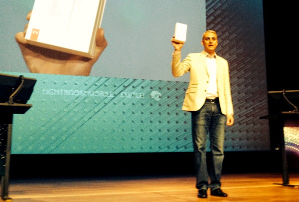
the event was over (and the live stream ended), David Wadhwani told the NY audience that there would be “One More Thing” – everyone would be going home with their own Ink and Slide hardware. A woman sitting near me literally flipped out. You know those clips you see when the Beatles or Elvis performed on the Ed Sullivan show? Yeah, it was like that.

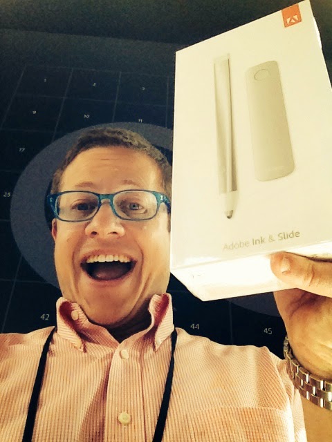
Adobe Ink and Slide is sold as a single package for $199 from Adobe’s website, and since there’s a lot of interest in it, I thought I’d document my own first experiences. So here is my unboxing and first impressions with Adobe’s first hardware offering.

As you would expect from Adobe, the packaging is beautiful. One of the Adobe product managers told me that the team was as proud of the packaging as they were of the product they’ve built. The packaging has the look and feel of something from Apple. Clean and white.


So basically, the contents of the box are Ink (the pen), Slide (the ruler), a carrying case/charger, a USB cable, and a cleaning cloth.


I figured I’d charge Ink (Slide doesn’t require any power to work), and plugged it into the USB port on my computer. The charger is magnetized, so Ink slides right in and “snaps” into place. An LED ring around the base of the charger glows and pulsates, indicating that Ink is charging.


I’m red-green color blind, and one of the most annoying things about technology is that just about EVERY digital indicator uses red/green/amber to indicate some form of status. News flash to all those engineers out there – THEY ALL LOOK THE SAME TO COLOR BLIND PEOPLE. The folks at Adobe are very kind to us color blind folk (there are cool features in Photoshop and Illustrator to simulate how your designs will look to people who are color blind), so while Ink is charging, the LED pulses. But once Ink is fully charged, the LED glows solid and cycles through all the colors of the rainbow. Kudos to Adobe for really thinking about these details.

At this point, I’m ready to start using Ink and Slide.

To turn Ink on, I press and hold on the button on the barrel of the pen until the LED at the top of the pen starts to glow with all colors of the rainbow. With Ink now powered up, I’m ready.


To start, I’ll need to download the two new mobile apps to my iPad -- I have the iPad Mini (regular, not Retina). I downloaded both Adobe Line and Adobe Sketch. To start, I’ll use Adobe Line. After launching Adobe Line, I am prompted to sign in with my Adobe Creative Cloud account. And in order to get started with using Ink, I have to open a document (or create a new one). At the upper right of the screen, I can click on the Pen icon to pair Ink, which I do by holding the tip of Ink to the red target circle for a few seconds. 


Next, I tap the Edit Ink button to set up and personalize my Ink, which is a 4-step process.

First, I choose a color. Ink is highly personalized and in an environment where there may be other Inks around, I want to be able to quickly identify mine by the color of the LED at the top of the pen. Pretty cool, as I move the pen around the color wheel, the LED glows with that color, helping me choose. Naturally, I choose yellow.


Next I give my Ink a name. Then, I get to choose a profile that matches how I hold a pen. This helps with palm rejection. I’m a lefty, so I find this very helpful. 


The final step is to link my Ink to my Creative Cloud account, which will allow me to use Ink to access things like my kuler themes and or clipboard items.


With that done, I’m now ready to draw!

I’ll post detailed reviews of my experiences with the mobile apps (Line and Sketch) after I’d had more time to play with them, but I wanted to get a feel for what the experience would be like to work with Adobe Ink and Slide, both in regard to their immediate functions as a pen and ruler, and also in regard to Adobe's integration with these tools and my Creative Cloud account.

Here are the key takeaways from my experience so far:

Ink: The pen feels nice in the hand, although a tad bit light for my own tastes. The pixelpoint tip is fantastic. Finally a point that's not a mushy rubbery blob. That being said, the point is made of hard plastic, and using it on the glass surface of the iPad is noisy. Noticeably. I mean, if you're in a meeting trying to take notes, I can see this being an issue, especially if a few people are using it. If you are annoyed or sensitive to those folks who pound the keyboard typing, this is pretty much what it sounds like. Also, the tiny point reveals an issue that folks who have used the Wacom Cintiq displays have had to deal with -- a noticeable distance between the point of the pen and the pixels that appear on the screen beneath the glass. The pen itself though performs well and there's no lag that I can tell. Also, the marks that this pen makes in Adobe's mobile apps are GORGEOUS. Even little blobs of ink as you start a line, etc. This really mimics real life media extremely well. Even the fact that you have two pencils to choose from (2H and HB) is a sign of what you're dealing with here. I really miss having an eraser on the flipside of the pen though.

Some folks know I love my Pencil from Fifty Three -- here's a closeup comparing the tips of Pencil and Ink. No contest here -- Ink wins hands down.


Slide: The concept of Slide is pure genius. Brilliance that you would expect from Adobe. Everything that Slide does is not only useful, but incredibly important to designers. That being said, the hardware itself is unnecessary, mainly because Adobe has built the functionality of Slide into the mobile apps... you can use your fingers to accomplish the same tasks. So Slide ends up being more of a gimmick. 

Here's what it looks like when I'm using Slide:


And here's what it looks like when I have the Slide functionality turned on in the app (it's that little circle you tap in the upper right menu to activate it) and using my fingers to do the same.


Because you have to use your fingers to scale your shapes anyway, you need a few extra hands to make all this work (one to hold Ink, one to hold Slide, one to scale the shapes or stamps), and if you like to prop your iPad up on an angle while you draw like I do, then Slide literally slides right off the iPad. Also, if you're drawing on your lap, you'll need a pair of hands to also hold your iPad. Don't let this take away how valuable the functionality of Slide is. It's brilliant and incredible. I just don't need the hardware (one more thing to get lost).

Creative Cloud integration: When you press the button on Ink while using Adobe's mobile apps, a menu pops up offering 5 options: Switch tips/tools, Choose colors, Choose shapes/stamps for use with Slide, Share, and Clipboard.


This menu is most useful when you work in fullscreen mode and hide the UI elements so that you can focus on your drawing. Switching tips/tools works as you'd expect. 

Choosing colors lets you connect to your own Kuler themes that you've created or you can browse any that live in the Kuler world. However, the experience is lacking. No search, and you don't see the names of the themes until you've loaded them into your document. Again, as a color blind person, I can't tell colors just by looking at them, so I need to see the names of colors. I'm hoping that in future updates, this experience will get much better.

Slide lets you use a variety of guides, shapes, and stamps, and tapping the Slide button gives you access to these. I cannot overstate how important and wonderful these are and how much they add to the drawing experience. But again, you don't need the actual Slide hardware to access and use this.

Sharing works as you'd expect, with the added coolness of being able to send your art directly to your desktop in Illustrator or Photoshop. Haven't been able to make that work yet, but I'm sure it's user error on my part.

Finally, the Creative Cloud clipboard is cool in concept. Basically you can press the button on Ink and hold the pen to the tablet for a second or two and it copies your art to the clipboard. You can then paste it anywhere else. Your clipboard can contain multiple items (kind of like how InDesign lets you store multiple items on a clipboard). However, the experience is a bit clunky or slow. I assume that will only get better as Adobe makes software improvements. The concept is sound however, and I'd think it will be useful.

Overall, I like Ink a lot. And while pricey at $199, the functionality and promise are worth the price, especially if you buy into the idea of Creative Cloud and see that as your tool of choice in your design career. In an Apple kind of way, Adobe has proven it can own the experience -- and build a tool that integrates well with software (and perhaps that's why they haven't support Android yet because maybe they can't deliver it there yet).

Got questions? Comments? Want to share your own experience? I welcome all questions and comments!